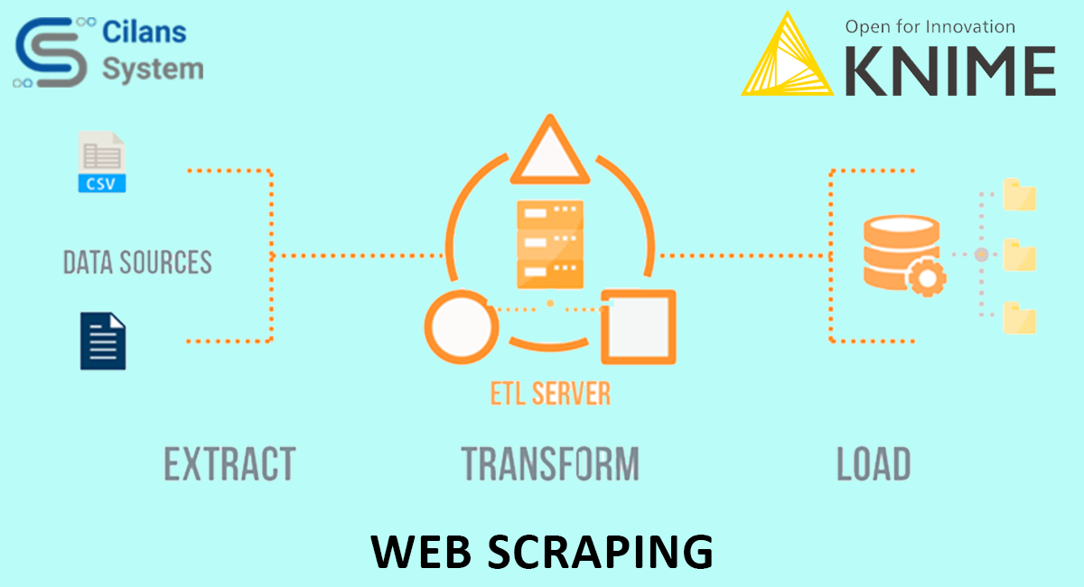
Web Scraping with KNIME
May 27, 2021
Comparing GDS and Power BI
June 6, 2021
Data Visualization is displaying any type of statistics in the simplest way possible. When the database is very large, this aspect helps in the lucidity of understanding. Be it in any field, science, finance, marketing, design, or anything, data visualization is now an integral part of it.
Visualization with GDS:
In this blog, we are using the following Dataset.
How to Visualize Above Data in GDS?
We already know google data studio has some easy-to-understand tools that makes visualization easy.
How to Insert Char?
- Click Add Chart button to Add New Chart
- GDS Provide following Chart :
- Theme and Layout: to change Page Theme
- Data Tab:
It is available on the Right side of Google data studio. To change the Data of your Dataset. Also, show column name in the dataset.
- Style Tab:
It is available on the Right side of Google data studio. To Change Designing of your report and Chart.
- Add Time Series Chart :
- Bar Chart
- Tree Map Chart :
Dataset Link: https://drive.google.com/drive/u/0/folders/1tDfM5jvhrOysWpJob6uMNPAn9YKoAHCK
GDS Report Link: https://datastudio.google.com/u/0/reporting/7b9c426c-7f2c-4eb4-a028-23d851c426fe/page/HEnKC
Source:

