Kubernetes
January 4, 2022
Infographics in Power BI
June 2, 2022Power BI : Recent Features: (2021)
By: Team Cilans
info@cilans.net
Microsoft’s Power BI has lots of interesting feature update in previous Year and this year (2022). This is extremely helpful to build any visualization and any Formatting to be applied to the report and dashboard.
This is trendy Features Power BI.
- Smart Narrative
- Maintain layer order option
- Zoom slicer
- Anomaly detection
- Bubble /Scatter plot custom Visual
- Create small multiple in PowerBI
Smart Narrative:
Introduction:
Many times, we see users use PowerPoint, text boxes, interactive headers, or custom visuals to add narrative to their data. All these options either lack interactive data, interactive and customizable text or use automatic insights.
Use:
The Smart narrative visualization helps you quickly summarize visuals and reports by providing relevant out-of-the-box insights that are customizable. these feature creators can add narratives to their report to address key takeaways, point out trends, edit the language, and format it to fit a specific audience. Instead of pasting a screenshot. the report is updated with every refresh.
How to Use Narrative:
Smart narrative features are available in visual Pan but when it’s not available Apply the following step. Go to File > Options and Settings > Options > Preview feature and make sure Smart Narrative visual is turned on. Then after you have to use it.


Maintain layer order option
Introduction:
When you add an image or image in the Power BI report view and front of Add chart that time you have to select an image or chart that time anyone will disappear. so, this solution maintains layer order. features effect shows only reading view
This How to Use Maintain layer order:
Now you can set any visual to stay in place rather than being brought to front upon selection: just turn on the Maintain layer order toggle for that visual in the General card of the formatting pane.

Zoom slider:
Introduction:
This is the coolest feature is that now you can add a zoom slider to cartesian charts (chart which includes horizontal and vertical axes) such as Stacked bar chart, line chart, Clustered Column Chart, Area chart, Stacked and line column chart, and so on.
Enabling a zoom slider to feature on a chart allows you to easily examine a smaller range of the data in a chart without having to use a filter.
How to Use Zoom slider:
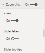
At first, you have to enable the Zoom Slider for this visual, Go to Format pane, and enable the Zoom Slider. as shown below.
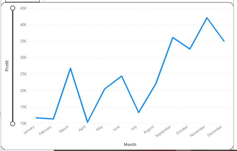
When you enable zoom, a slider looks like this.
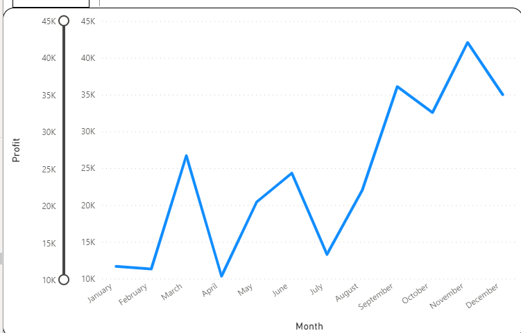
You can also enable a Slider labels option, which indicates a new row of labels next to the slider indicating the full range of the data.

Anomaly detection
Introduction:
Anomaly detection helps you enhance your line charts by automatically detecting anomalies in your time series data. It also provides explanations for the anomalies to help with root cause analysis. With just a couple of clicks, you can easily find insights without having to slice and dice the data.
How to Use Anomaly detection
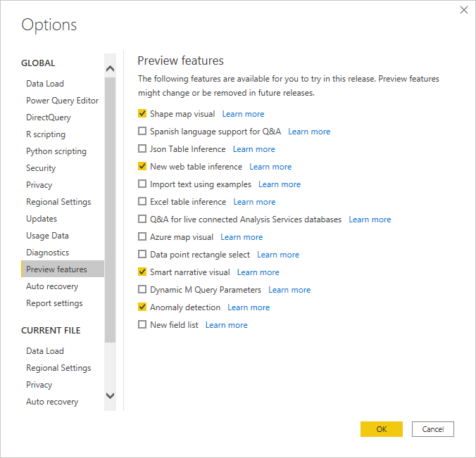
you will need to first turn on the feature switch by going to File > Options and Settings > Options > Preview feature and make sure Anomaly detection is turned on:
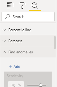
You can enable Anomaly detection by selecting the chart and adding the “Find Anomalies” option in the analytics pane.
You can format the anomaly’s shape, size, color and , style, and transparency of the expected range. You can also configure the parameter of the algorithm. If you increase the sensitivity, the algorithm is more sensitive to changes in your data. In that case, even a slight deviation is marked as an anomaly. If you decrease the sensitivity, the algorithm is more selective on what it considers an anomaly.

Bubble /Scatter plot custom Visual:
Introduction:
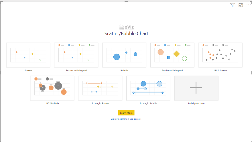
The xViz Scatter/ Bubble chart provides 9 quick-start templates, including Scatter, Bubble, and an IBCS variation for both. A Scatterplot chart displays the relationship between two numerical values (X and Y coordinate) and is ideal for correlation analysis and outlier detection. The bubble chart further enhances the Scatterplot’s information density by adding a size variable as a third dimension.
How to Use Bubble/Scatter Chart:
At first, you have to download Bubble scatter chart then you have to install it.
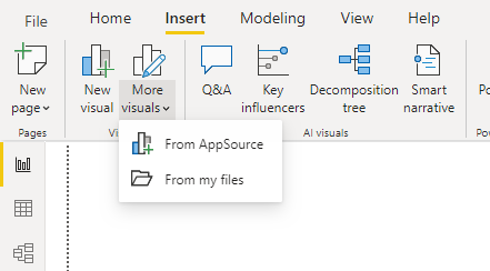
Go to the insert > More Visuals > From App Source.
Search Bubble / Scatter Chart.

Bubble / Scatter Chart looks like this:
- Create Small Multiples in PowerBI :
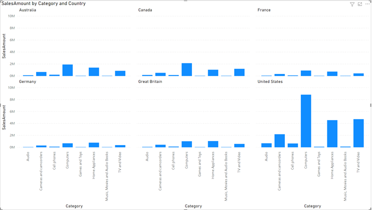
Small multiples, or trellising, splits a visual into multiple versions of itself.
The versions are presented side by side, with data divided across these versions by a chosen dimension.
For example, a small multiple could split a “sales by category” column chart across product lines or regions.
Enable the Preview Features
File menu, select Options and settings > Options > Preview features, and select the small multiples check box.

Note: Restart Power BI Desktop, and you’re ready to try small multiples.
Create Small multiples:
Put any column into small multiple Field to show multiple charts of same category

Change the grid Dimension
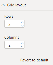
You can change the dimensions of the grid in the Grid layout card:
Default Grid: 2X2
You adjust the number of rows and columns to up to 6×6.
